Create Custom Pre/Post Frequency and Percent tables in SPSS

This tutorial outlines how to create a pre/post table using SPSS. For each variable, summary measures are shown over four rows. The first two rows show measures for pretest responses. The second two rows show measures for posttest responses. Each of these row pairs has a similar pattern: the first row shows counts; the second row displays percentages. By following the steps presented here, you’ll end up with concise tables fit for publication.

Prepare data for analysis

  1. Navigate to the IBM SPSS Statistics Data Editor
    • Click tab Variable View
  2. For each desired variable, change the Measure scale to Ordinal
  3. For each desired variable, make sure values under Values are exactly the same
    • To do this, copy one variable value and paste it into the values of the remaining variables
  4. Arrange your variables so that each pretest variable comes before each post variable

Open the Custom Tables window

  1. Click Analyze
    • Click Tables
      • Click Custom Tables…
      • The Custom Tables window will appear

Create custom table

  1. Navigate to the Custom Tables window
    • Add variables to table
      • Under Variables:, select desired variables
        • Drag selected variables to the Rows bar
          • A table object will appear in the Rows Columns area
    • Reshape custom table
      • Under the Category Position: dropdown menu, select Row Labels in Columns
      • Navigate to the Summary Statistics area (not the button)
        • Under the Position: dropdown menu, select Rows

Specify statistics

  1. Select all variables
  2. Under Define, click Summary Statistics…
    • The Summary Statistics: window will appear
  3. Under Display:, clear the default statistics
    • To clear a statistic, select it and click the left directed arrow
      • The statistic will no longer appear in the Display: area
      • The statistic will now appear in under the Statistics: area
  4. Under Statistics:, select desired statistics
    • Select Count
      • Under Statistics:, click Count then click the right directed arrow
        • The statistic will now appear in the Display: area
        • The statistic will no longer appear in under the Statistics: area
    • Select Row Valid N %
      • Under Statistics:, click Row Valid N %then click the right directed arrow
        • The statistic will now appear in the Display: area
        • The statistic will no longer appear in under the Statistics: area
    • Click Apply to Selection

Specify custom statistic

  1. Select all variables
  2. Under Define, click Categories and Totals…
    • The Categories and Totals window will appear
  3. Under Subtotals and Computed Categories, click Add Category…
    • The Define Computed Category window will appear
  4. Create a statistic
    • Next to Label for Computed Category:, type the word Total
    • Under Expression for Computed Category:, type in the expression [1] + [2] + [3] + [4] + [5]
    • Next to Hide categories used in expression from table, uncheck the box
    • Click Continue
  5. From the Display area, reposition the Total value
    • Under Label, select the Total
    • Click the upward directed arrow until Total is at the top of the list
  6. Click Apply

Produce table

  1. From the Custom Tables window, click OK

SPSS syntax to create table

* Custom Tables.
CTABLES
/VLABELS VARIABLES=V1_pre V1_post DISPLAY=DEFAULT
/PCOMPUTE &cat1 = EXPR([1] + [2] + [3] + [4] + [5])
/PPROPERTIES &cat1 LABEL = "Total" FORMAT=COUNT F40.0, ROWPCT.VALIDN PCT40.1 HIDESOURCECATS=NO
/TABLE V1_pre [COUNT F40.0, ROWPCT.VALIDN PCT40.1] + V1_post [COUNT F40.0, ROWPCT.VALIDN PCT40.1]
/SLABELS POSITION=ROW
/CLABELS ROWLABELS=OPPOSITE
/CATEGORIES VARIABLES=V1_pre V1_post [&cat1, 1, 2, 3, 4, 5, OTHERNM] EMPTY=INCLUDE.

Identifying cliques and clique comembers in R using the SNA package

The R package SNA provides a number of tools for analyzing social network data. This post reviews the function clique.census from the SNA package, and shows how it can be used to better understand the group structure among a list of network members.

Let’s start by creating a toy network. Say Henry, Sarah, Rick, Joe and Annie are all colleagues in a criminology department. Now imagine they’ve been asked to identify the most important people they collaborate with. The results of this fictitious effort are shown in the following edgelist.

edgelist <- matrix(c("Henry", "Sarah", "Henry", "Joe", "Sarah", "Joe", "Henry", "Sarah", "Henry", "Rick", "Sarah", "Rick", "Sarah", "Henry", "Sarah", "Rick", "Henry", "Rick", "Sarah", "Henry", "Sarah", "Joe", "Henry", "Joe", "Sarah", "Rick", "Sarah", "Annie", "Rick", "Annie"), ncol = 2)

Recall, a clique is a group where everyone in it “likes” everyone else. To identify cliques among our network of criminology researchers, we first transform it into a network object and then apply the SNA function clique.census.

library("network")

net tabulate.by.vertex=FALSE, enumerate=TRUE, clique.comembership="bysize") # Identify cliques
net_cc$clique.count


sna clique comembership 1

After applying the function clique.census, we see there were two cliques among our respondents, each involving three researchers.

To identify the comembers of these cliques, we inspect the contents of the variable net_cc$clique.comemb[3, , ].

To paraphrase the SNA documentation, the variable net_cc$clique.comemb is a three dimensional matrix of size max clique size x n x n. In this example we observed cliques involving only three network members each. As such, the 3-clique comembership information is stored in the variable net_cc$clique.comemb[3, , ]. (Note: if we observed one or more cliques with more than three members, say, a 4-clique, we could examine their comembership using the variable net_cc$clique.comemb[4, , ]).

Notably, the format by which net_cc$clique.comemb[3, , ] organizes clique comembership takes some getting used to. In fact, the main point of this post is to explain this organizational scheme in a more everyday kind of way.

Given our criminologist cliques, here’s how we find out who was in them. Recall, the largest clique we observed contained three individuals. Further recall that our network only contained five respondents. As such, the matrix net_cc$clique.comemb[3, , ] is of size 5 x 5. This matrix mimics the network structure itself. That is, network members are listed along the rows and, in the exact same order, listed again across the columns. The values within the matrix then identify researchers who were in cliques together.

sna clique comembership 2

Let’s go through a couple columns together to better understand what this matrix is telling us exactly.

The values in the column Joe show who Joe was in a clique with. Zero values indicate who Joe was not in a clique with, while values greater than zero indicate who he was in a clique with. More than just showing who Joe was in a clique with, these values identify the different cliques he was a part of. Reading the column from top to bottom, Joe and Annie were in zero cliques together. Next we see that Joe was in a clique with Henry. Notably, Joe was in one clique with himself (i.e., there was only one clique that involved Joe). The rest of the column values show that Joe was in zero cliques with Rick and one clique with Sarah. In total, this column tell us there was one 3-clique that involved Joe (see Joe’s value for Joe) and that this clique involved the researchers Henry and Sarah.

Let’s look at a trickier column. The values in the column for Henry ranged from 0 to 2. As with Joe, the values show who Henry was in a clique with and how many times they were in the same clique. Going down the column, we see a zero value for Henry and Annie. That is, Henry and Annie were not part of the same clique. Notably, Henry is in two cliques with himself. That is, there were two cliques, each of which involved Henry. The rest of the values show that Henry was in one clique with Joe, another clique with Rick and two cliques with Sarah.

Combined, these column values tell us there were two 3-cliques: one clique involving Henry, Sarah and Joe and another involving Henry, Sarah and Rick.

Omit outdated records after adding amended records

In the juvenile court judges often have the power to amend charges applied to a case. A charge of “INTENT TO DISTRIBUTE” may, for instance, be reduced to something less severe, say “POSSESSION OF PARAPHERNALIA.” When this occurs, a new charge is added to a case record and the old charge is, in some cases, retained. This short post presents R code to omit outdated charges after amended charges have been added.

Data for this example consist of charges applied to a single court record. These data are provided below:

charge=c("Count 1", "Count 2", "Amended", "Count 3", "Amended")
section=c("21-5807(a)(3)", "21-5807(a)(3)", "21-5801(b)(4)", "21-5807(a)(3)", "21-5801(b)(4)")
date=c("09/13/15", "09/20/15", "04/04/16", "10/03/15", "04/04/16")
title=c("BURGLARY OF MOTOR VEHICLE", "BURGLARY OF MOTOR VEHICLE", "THEFT", "BURGLARY OF MOTOR VEHICLE", "THEFT")
acs=c("", "", "", "", "")
drug=c("", "", "", "", "")
pl=c("", "", "", "", "")
finding=c("DISMISS BY PROS", "", "DISMISS BY PROS", "", "DISMISS BY PROS")
tp=c("F", "F", "M", "F", "M")
lvl=c("9", "9", "A", "9", "A")
pn=c("N", "N", "N", "N", "N")
sentence_date=c("", "", "04/04/2016", "", "04/04/2016")

df <- data.frame(charge, section, date, title, acs, drug, finding, tp, lvl, pn, sentence_date,stringsAsFactors=FALSE)

The goal here is to remove every charge that is followed by an amended charge. The following dataset illustrates the desired result:

charge=c("Count 1", "Amended", "Amended")
section=c("21-5807(a)(3)", "21-5801(b)(4)", "21-5801(b)(4)")
date=c("09/13/15", "04/04/16", "04/04/16")
title=c("BURGLARY OF MOTOR VEHICLE", "THEFT", "THEFT")
acs=c("", "", "")
drug=c("", "", "")
pl=c("", "", "")
finding=c("DISMISS BY PROS", "DISMISS BY PROS", "DISMISS BY PROS")
tp=c("F", "M", "M")
lvl=c("9", "A", "A")
pn=c("N", "N", "N")
sentence_date=c("", "04/04/2016", "04/04/2016")

df <- data.frame(charge, section, date, title, acs, drug, finding, tp, lvl, pn, sentence_date,stringsAsFactors=FALSE)

One way to achieve this new dataset is to identify all charges that are followed by an amended charge and extract all charges except these original charges.

First, the positions of the updated charges are identified. The following expression identifies the updated charges as TRUE and all other charges as FALSE.

c(df$charge=="Amended")

Second, the positions of the updated charges are used to identify the positions of the original charges that were amended. This is accomplished by recognizing a pattern in the charges themselves. Updated charges in this dataset are always preceded by their original charge. Since the updated charges were identified as TRUE (and the non-updated charges identified as FALSE), shifting these values by one position identifies the original charges.

c(c(df$charge=="Amended")[-1], c(df$charge=="Amended")[1])

Finally, the positions of the original charges (i.e., the charges followed by the amended ones) are used to extract the desired dataset. The desired dataset consists of every charge not followed by an updated charge.

df[!c(c(df$charge=="Amended")[-1], c(df$charge=="Amended")[1]),]

Plot Network Data in R with iGraph

I recently had a conversation on Twitter about a plot I made a while back. Recall, the plot showed my Twitter network, my friends and my friend’s friends.

Here’s the Twitter thread:

And here’s the R code:

#### Load R libraries
library("iGraph")

#### Load edgelist
r <- read.csv(file="edgelist_friends.csv-03-25.csv",header=TRUE,stringsAsFactors=FALSE)[,-1]

#### Convert to graph object
gr <- graph.data.frame(r,directed=TRUE)

#### gr
# Describe graph
summary(gr)
ecount(gr) # Edge count
vcount(gr) # Node count
diameter(gr) # Network diameter
farthest.nodes(gr) # Nodes furthest apart
V(gr)$indegree = degree(gr,mode="in") # Calculate indegree

#### Plot graph
E(gr)$color = "gray"
E(gr)$width = .5
E(gr)$arrow.width = .25
V(gr)$label.color = "black"
V(gr)$color = "dodgerblue"
V(gr)$size = 4

set.seed(40134541)
l <- layout.fruchterman.reingold(gr)

pdf("network_friends_plot.pdf")
plot(gr,layout=l,rescale=TRUE,axes=FALSE,ylim=c(-1,1),asp=0,vertex.label=NA)
dev.off()

Create a dictionary of authors and author attributes and values for a journal article using the Scopus API and Python

As an exercise to brush up my Python skills, I decided to tinker around with the Scopus API. Scopus is an online database maintained by Elsevier that records and provides access to information about peer reviewed publications. Not only does Scopus let users search for journal articles based on key words and various other criteria, but the web services also allows users to explore these articles as networks of articles, authors, institutions, and so forth. If you’re interested in risk factors that lead to scholarly publications, publication citations, or impact factors, this is a place to start.

The following code yields a dictionary of author information by requesting content through the abstract retrieval API. This request is made using the Python package requests and parsed using the package BeautifulSoup. Enjoy!

#### Import python packages
import requests
from bs4 import BeautifulSoup


#### Set API key
my_api_key = 'YoUr_ApI_kEy'


#### Abstract retrieval API
# API documentation at http://api.elsevier.com/documentation/AbstractRetrievalAPI.wadl
# Get article info using unique article ID
eid = '2-s2.0-84899659621'
url = 'http://api.elsevier.com/content/abstract/eid/' + eid

header = {'Accept' : 'application/xml',
          'X-ELS-APIKey' : my_api_key}

resp = requests.get(url, headers=header)

print 'API Response code:', resp.status_code # resp.status_code != 200 i.e. API response error

# Write response to file
#with open(eid, 'w') as f:
#    f.write(resp.text.encode('utf-8'))

soup = BeautifulSoup(resp.content.decode('utf-8','ignore'), 'lxml')

soup_author_groups = soup.find_all('author-group')

print 'Number author groups:', len(soup_author_groups)

author_dict = {}

# Traverse author groups
for i in soup_author_groups:

    # Traverse authors within author groups
    for j in i.find_all('author'):

        author_dict.update({j.attrs['auid']:j.attrs}) # Return dictionary of attributes
      
        j.contents.pop(-1) # Pop dicitonary of attributes
 
        # Traverse author contents within author
        for k in j.contents:

            author_dict[j.attrs['auid']].update({k.name : k.contents[0]})
            
print author_list

Jitter scatterplot value positions with value labels in R using ggplot2

The following R code creates a scatterplot using ggplot2. Points on this plot are represented by identification numbers. The jitter option removes overlap between these plotted values.

#### Attach R libraries
library("ggplot2")


#### Generate random data set 
theData <- data.frame(id=1:20, xVar=sample(1:4, 20, replace=TRUE), yVar=sample(1:4, 20, replace=TRUE))


#### Plot scatterplot
set.seed(seed=658672)
p <- ggplot(theData)
p + theme_bw() + geom_text(aes(x=xVar,y=yVar,label=id),size=3,position=position_jitter(w=.2, h=.2))

Convert Qualitative Codes into a Binary Response Matrix in R

Content analysis is a qualitative method for identifying themes among a collection of documents. The themes themselves are either derived from the content reviewed or specified a priori according to some established theoretical perspective or set or research questions. Documents are read, content is considered and themes (represented as letter “codes”) are applied. It’s not uncommon for documents to exhibit multiple themes. In this way, results from a content analysis are not unlike responses to the “select all that apply” type questions found in survey research. Once a set of documents is coded, it’s often of interest to know the proportion of times the codes were observed.

The following R code transforms codes on a set of documents, stored as a list of lists, into a binary matrix.

#### Load R packages
library("XLConnect")
library("stringr")
library("vcd")


#### Working directory
getwd()
setwd("C:/Users/chernoff/Desktop")


#### Read data
theData <- readWorksheet(loadWorkbook("dummyData.xlsx"),sheet="Sheet1",header=TRUE)


#### Parse codes
theData2 <- str_extract_all(theData$codes,"[a-zA-Z]")

codeList <- unique(unlist(theData2))

theData2 <- lapply(X=theData2,function(X) as.data.frame(matrix(as.numeric(codeList%in%X),ncol=length(codeList),dimnames=list(c(),codeList))))
theData3 <- do.call(rbind,theData2)

theData4 <- cbind(theData,theData3)

If we print the data to the screen, we see themes are represented as binary variables, where 1 indicates a theme was observed and 0 indicates it was not.

binaryMatrix

Once the data are organized as a binary matrix, we can calculate column totals colSums(theData4[,codeList]) to see which themes were more popular and which ones were least popular.

binaryMatrixColSums

And lastly, if we want to get fancy, we can represent the data using a mosaic plot.

totals <- table(theData4$a,theData4$b,theData4$c,dnn=c("A","B","C"))

png("mosaicPlot.png")
mosaicplot(totals,sort=3:1,col=hcl(c(120,10)),"Mosaic Plot")
dev.off()

mosaicPlot

A mosaic plot shows the relative proportion of each theme compared to one or more of the other themes. The main two rows show the levels of theme B. The main two columns represent theme C’s levels. And the two columns within the two main columns represent the levels of A. By default, the label for theme A is not shown. The cell in the upper left-hand corner, i.e. cell (1,1), shows there were some but not many documents without any themes. Cells (1,3) and (1,4) show there were an equal number of documents with theme C as there were that involved themes A and C combined. The remaining cell in this first row (1,2) shows there were more documents pertaining solely to theme A than all other document types not containing theme B. Interpretations of the remaining rectangles follow similarly.

Batch Convert HTML files to PDF with wkhtmltopdf in Mac OSX

The open source (LGPL) command line tool wkhtmltopdf can quickly and robustly transform HTML files to PDF. To transform a set of files, navigate to the desired folder and enter into the Terminal app the syntax:

for f in *F1F*.html; do wkhtmltopdf -g -s Letter --no-background "$f" "${f/_*_/_}.pdf";done

The syntax takes every HTML file in a folder and generates from it a PDF file. The wkhtmltopdf command options modify the files generated: -g sets greyscale, -s Letter sets paper size, and --no-background omits background content. For more options check out the wkhtmltopdf auto-generated manual.

Plot and Highlight All Clique Triads in VISONE

snaCliques

Description

This post describes how to identify group structures among a network of respondents in VISONE. For a network of selections we identify any cliques involving three or more members. A clique is defined as a group containing three or more members where everyone has chosen everyone else.

Identify all triads

A tried is a network structure containing exactly three members. There are many types of triads. A group of three members where everyone chooses everyone else is a triad (i.e., a clique). A group of three members where two people choose each other and nobody choose the third member is another type of triad. There are 16 unique ways three people can select each other.

Identify all triads. Click the ‘analysis’ tab. Next to ‘task’, select ‘grouping’ from the drop down list of available options. Select ‘cohesiveness’ from the drop down list next to ‘class’. Select the option ‘triad census’ next to ‘measure’. Click ‘analyze’.

Highlight all cliques

Highlight all cliques. Click an empty part of the graph. Press the keys ‘Ctrl’ and ‘a’. Open the attribute manager. Click the ‘link’ button. Click the ‘filter’ button. Select ‘default value’ from the first drop down list. Select ‘triadType300’ from the second drop down list. Select ‘has individual value’ from the third drop down list. Click the radial button ‘replace’. Click ‘select’. Click ‘close’.

From the main VISONE drop down bar, select ‘links’. Click ‘properties’. Click the given color next to ‘color:’. Select ‘rgb’ tab. Set the ‘red’, ‘green’, and ‘blue’ values to 0. Set the ‘alpha’ value to 255. Set ‘opacity’ to 50%. Click the ‘close’ button. Set the ‘width:’ value to 5.0. From the ‘edge properties’ dialogue box, click the ‘apply’ button. Click ‘close.

Reduce visibility of all non-clique selections. Select all nodes and links. Click an empty part of the graph. Press the keys ‘Ctrl’ and ‘a’. Open the attribute manager. Click the ‘link’ button. Click the ‘filter’ button. Select ‘default value’ from the first drop down list. Select ‘triadType300’ from the second drop down list. Select ‘has individual value’ from the third drop down list. Click the radial button ‘remove’. Click ‘select’. Click ‘close’.

From the main VISONE drop down bar, select ‘links’. Click ‘properties’. Click the given color next to ‘color:’. Set ‘opacity’ to 20%. Set the ‘width:’ value to 2.0. From the ‘edge properties’ dialogue box, click the ‘apply’ button. Click ‘close.

How to extract a network subgraph using R

In a previous post I wrote about highlighting a subgraph of a larger network graph. In response to this post, I was asked how extract a subgraph from a larger graph while retaining all essential characteristics among the extracted nodes.

Vinay wrote:

Dear Will,
The code is well written and only highlights the members of a subgraph. I need to fetch them out from the main graph as a separate subgraph (including nodes and edges). Any suggestions please.

Thanks.

Extract subgraph
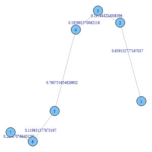
For a given list of subgraph members, we can extract their essential characteristics (i.e., tie structure and attributes) from a larger graph using the iGraph function induced.subgraph(). For instance,

library(igraph)                   # Load R packages

set.seed(654654)                  # Set seed value, for reproducibility
g <- graph.ring(10)               # Generate random graph object
E(g)$label <- runif(10,0,1)       # Add an edge attribute

# Plot graph
png('graph.png')
par(mar=c(0,0,0,0))
plot.igraph(g)
dev.off()

g2 <- induced.subgraph(g, 1:7)    # Extract subgraph

# Plot subgraph
png('subgraph.png')
par(mar=c(0,0,0,0))
plot.igraph(g2)
dev.off()

Graph
graph

Subgraph
subgraph